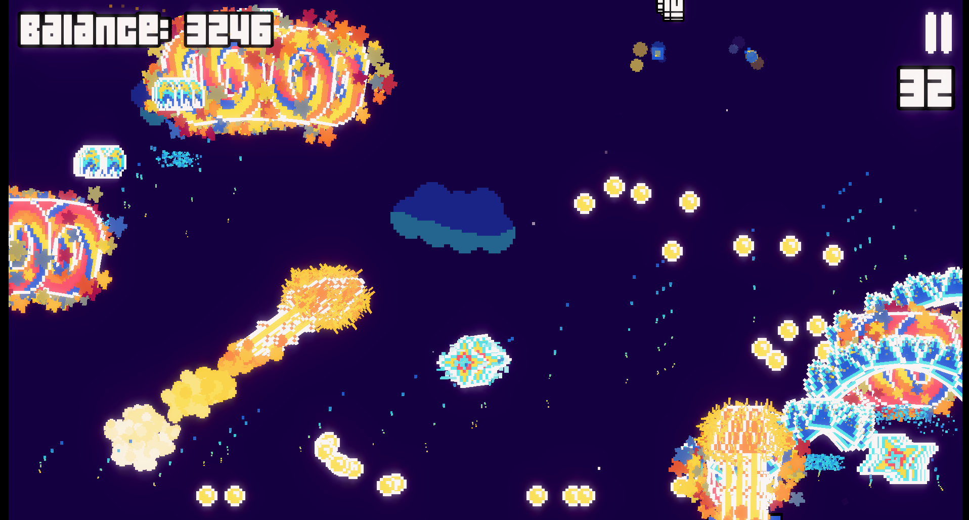
This game is pretty fun, but I do wish there was something to end it. At the moment it pretty much goes until your PC gives up on you. Which for me was after 5 or 6 mirrors combined with every projectile option. That isn't technically when my computer gave up but at that point the rounds were taking upwards of 2 minutes each. and I just don't have that kind of patience.
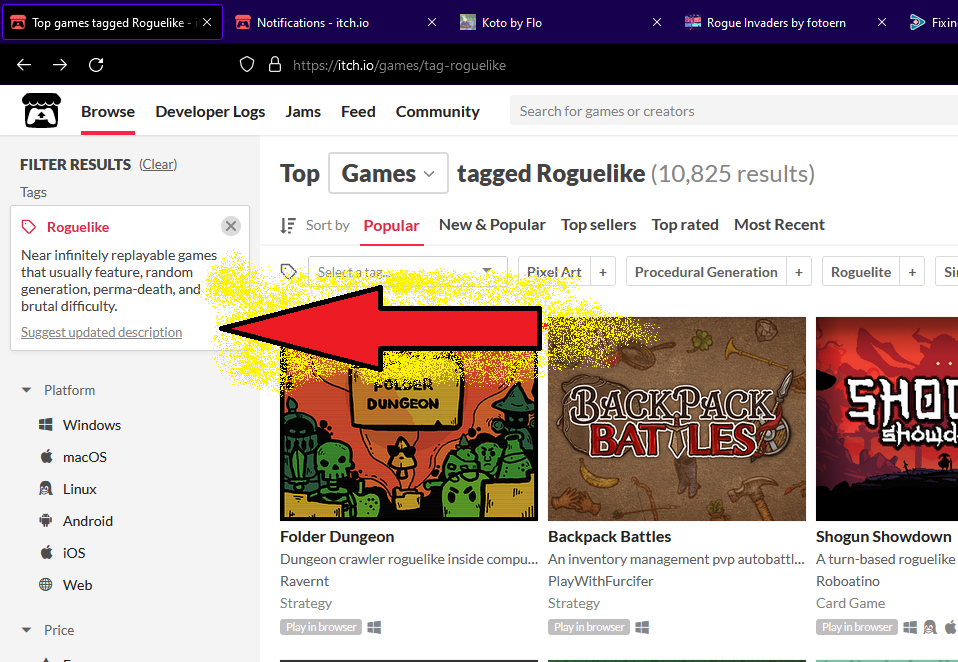
This is not the correct place to express your displeasure. As far as this guy is concerned this game is a roguelike, it more or less fits the description given by itch.io afterall. If you wish for a change to itch.io's description then you can submit an updated description to see about getting it fixed.
Here's the problem with that: Itch.io doesn't care. They want wide appeal and they will likely use the most widely usable(even if misused) term and definition even if it runs counter to what the term means at its core.
I really like this idea. Needs refinement, but ain't that always the way.
* It's jarring to interrupt the game suddenly to show the purchase screen, the player should have some warning the gameplay is about to change modes. Maybe a progress bar? * Speaking of progress, telling us what "wave" we're on while we play would satisfy those of us who like progression. * Purchase prices are weird, how "common" can be more expensive than "rare" or "legendary," and after wave 6 the gameplay stopped to offer me purchases I could not afford, making the interruption not useful. * The "return" button on the purchase screen is hidden behind the itch.io "View all" "Folow" etc buttons. That's not a you problem that's Itch. * The game pauses sometimes, I suspect because it's loading a new sound asset just before playing the sound. Maybe Godot needs more hints about pre-loading assets.
Hey, I appreciate the feedback! I'm thinking of making the waves longer overall so the players actually have enough balance to spend and it never feels like an interruption. I'll probably end up re balancing the prices/upgrades as well to fit the new wave length.
I agree that the HUD should provide more info, I'm still trying to find a way to fit the icons on screen because enemies spawn unconventionally at the top of the viewport, which is where most games would usually place their icons and game info. Still working on that point.
Finally thanks for pointing out the bug that Itch.io is hiding the buttons, I'll be sure to fix that for the next update!
← Return to Rogue Invaders
Comments
Log in with itch.io to leave a comment.
hello! here's our gameplay video for Rogue Invaders (Beta).
We really enjoyed playing it and featuring it on our platform.
This game is pretty fun, but I do wish there was something to end it. At the moment it pretty much goes until your PC gives up on you. Which for me was after 5 or 6 mirrors combined with every projectile option. That isn't technically when my computer gave up but at that point the rounds were taking upwards of 2 minutes each. and I just don't have that kind of patience.
Thanks for playing, I just added a win condition in the latest patch
"Roguelikes" are turn based games that have a lot of disability access due to the way they play. This isn't playable to me. I'm not saying it's "bad." I'm saying it lacks the disability access that roguelikes bring to the table when it comes to gaming. This article does a great job at explaining things
This is what I've personally wrote on the subject.
This is not the correct place to express your displeasure. As far as this guy is concerned this game is a roguelike, it more or less fits the description given by itch.io afterall. If you wish for a change to itch.io's description then you can submit an updated description to see about getting it fixed.
Here's the problem with that:
Itch.io doesn't care.
They want wide appeal and they will likely use the most widely usable(even if misused) term and definition even if it runs counter to what the term means at its core.
Nice take on the Space Invaders genre. How can I trigger the Spells?
I really like this idea. Needs refinement, but ain't that always the way.
* It's jarring to interrupt the game suddenly to show the purchase screen, the player should have some warning the gameplay is about to change modes. Maybe a progress bar?
* Speaking of progress, telling us what "wave" we're on while we play would satisfy those of us who like progression.
* Purchase prices are weird, how "common" can be more expensive than "rare" or "legendary," and after wave 6 the gameplay stopped to offer me purchases I could not afford, making the interruption not useful.
* The "return" button on the purchase screen is hidden behind the itch.io "View all" "Folow" etc buttons. That's not a you problem that's Itch.
* The game pauses sometimes, I suspect because it's loading a new sound asset just before playing the sound. Maybe Godot needs more hints about pre-loading assets.
Hey, I appreciate the feedback! I'm thinking of making the waves longer overall so the players actually have enough balance to spend and it never feels like an interruption. I'll probably end up re balancing the prices/upgrades as well to fit the new wave length.
I agree that the HUD should provide more info, I'm still trying to find a way to fit the icons on screen because enemies spawn unconventionally at the top of the viewport, which is where most games would usually place their icons and game info. Still working on that point.
Finally thanks for pointing out the bug that Itch.io is hiding the buttons, I'll be sure to fix that for the next update!